Creating Design Systems For Consistency At Scale
Product
Responsive Web App
Role
Principal Designer
Category
Email Distribution & Analytics
When
July 2022 - January 2023
Context
StreetContext, a leading email analytics platform used in
capital markets, faced challenges in maintaining consistency,
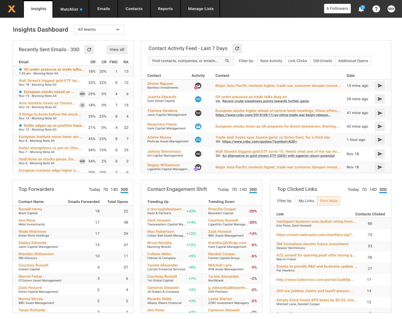
efficiency and scalability with their web app’s design language
and user experience.
Problem
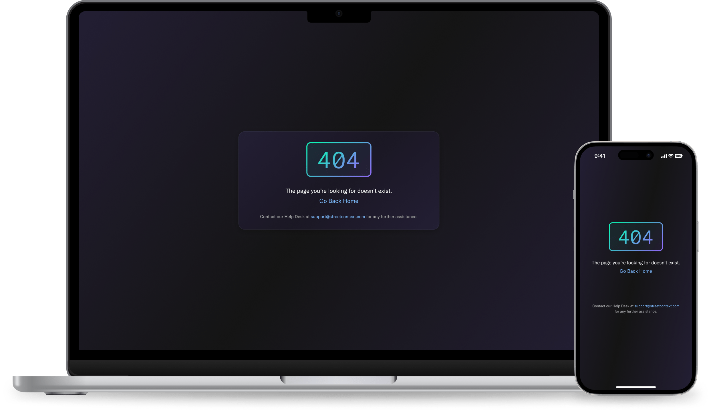
The lack of a standardized design approach resulted in
fragmented user experiences and increased development time for
front-end oriented work.
Research
I began with a phased rollout with fewer than 10 users to pinpoint
critical usability issues. After iterating on early feedback, I
released an update to more than 50 users. The final phase encompassed
all 2,500+ accounts, ensuring the updates were smoothly integrated
across the entire user base.
This structured approach allowed me to efficiently address usability issues at each stage, including the identification and resolution to a huge problem.
If you’re still reading this, ask me about it…
This structured approach allowed me to efficiently address usability issues at each stage, including the identification and resolution to a huge problem.
If you’re still reading this, ask me about it…
Theron Quill
Frustrated User
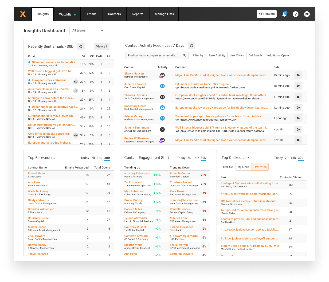
The current user interface feels quite outdated and sometimes
impedes my workflow. Navigating through menus is not intuitive.
Liora Sterling
Frustrated User
These workflows require too many steps to accomplish what should
be simple tasks, which is frustrating.
Caspian Vale
Frustrated User
The data tables are very difficult to read and analyze. The lack
of contrast makes it hard to gather information with a glance.
Working With Product
To introduce the design system into the product roadmap, I presented a
compelling case that highlighted the potential time and cost savings,
improved user experiences, and long-term scalability benefits.
By demonstrating how the design system aligned with the company's strategic goals and product vision, I successfully gained buy-in from stakeholders and secured a spot on the product roadmap.
By demonstrating how the design system aligned with the company's strategic goals and product vision, I successfully gained buy-in from stakeholders and secured a spot on the product roadmap.
Strategic Considerations
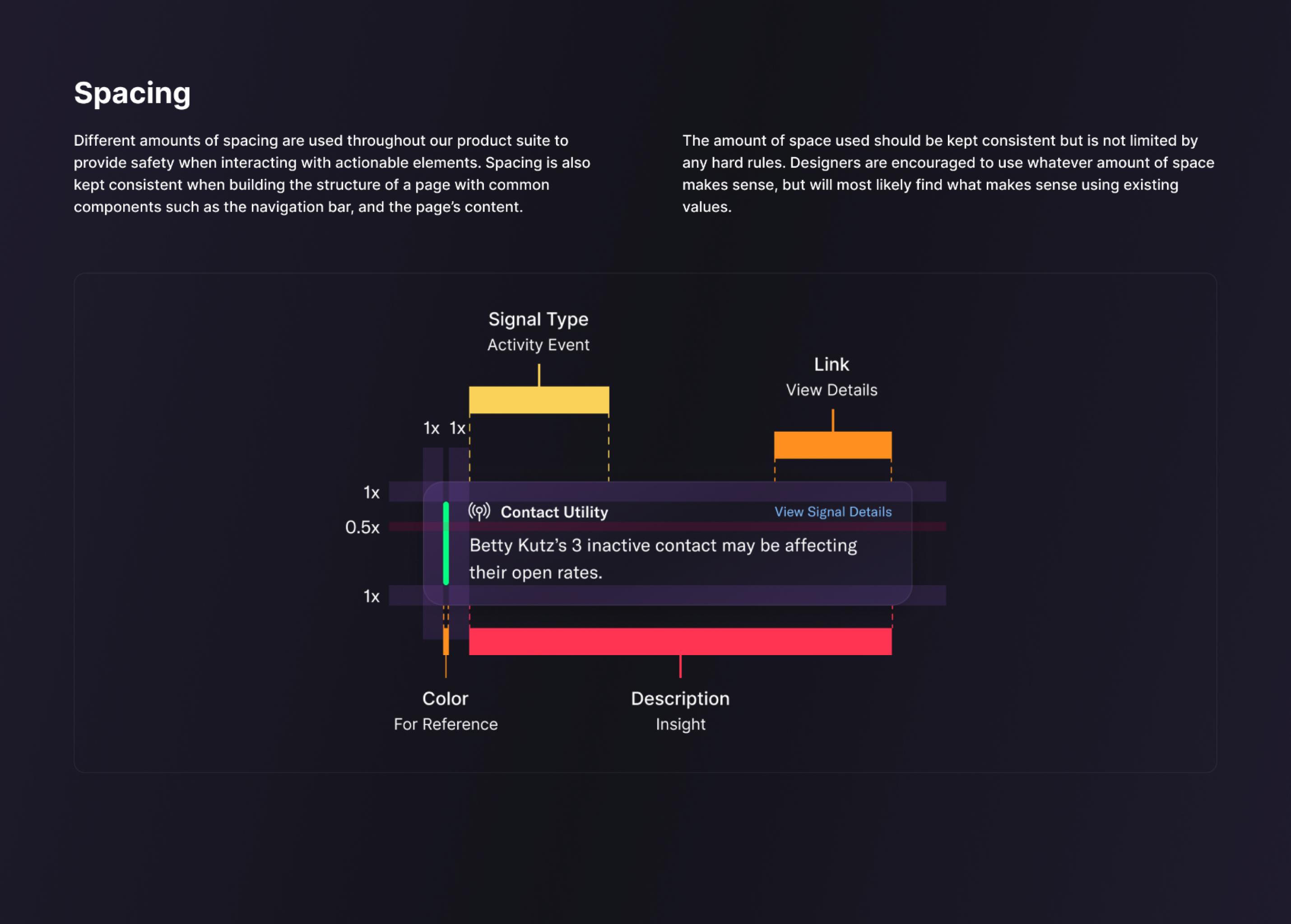
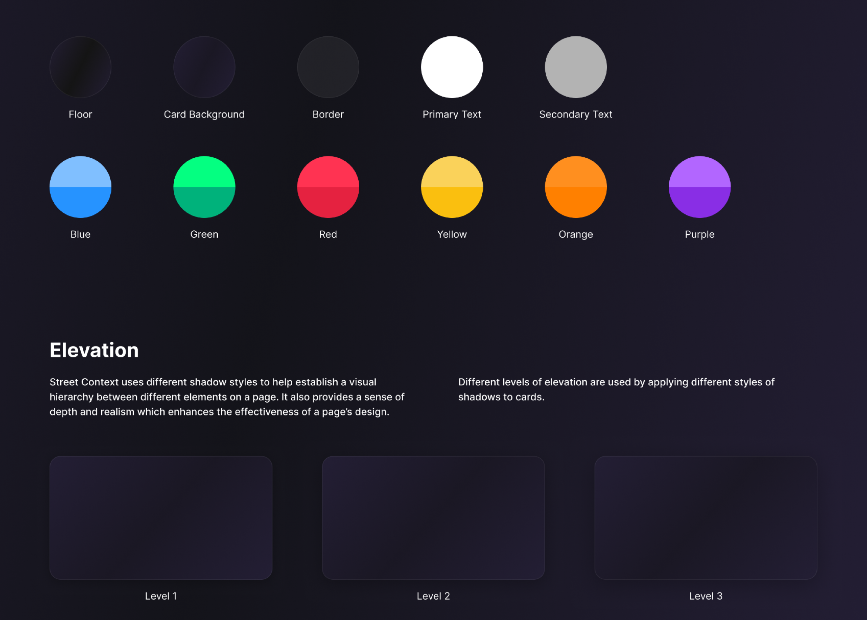
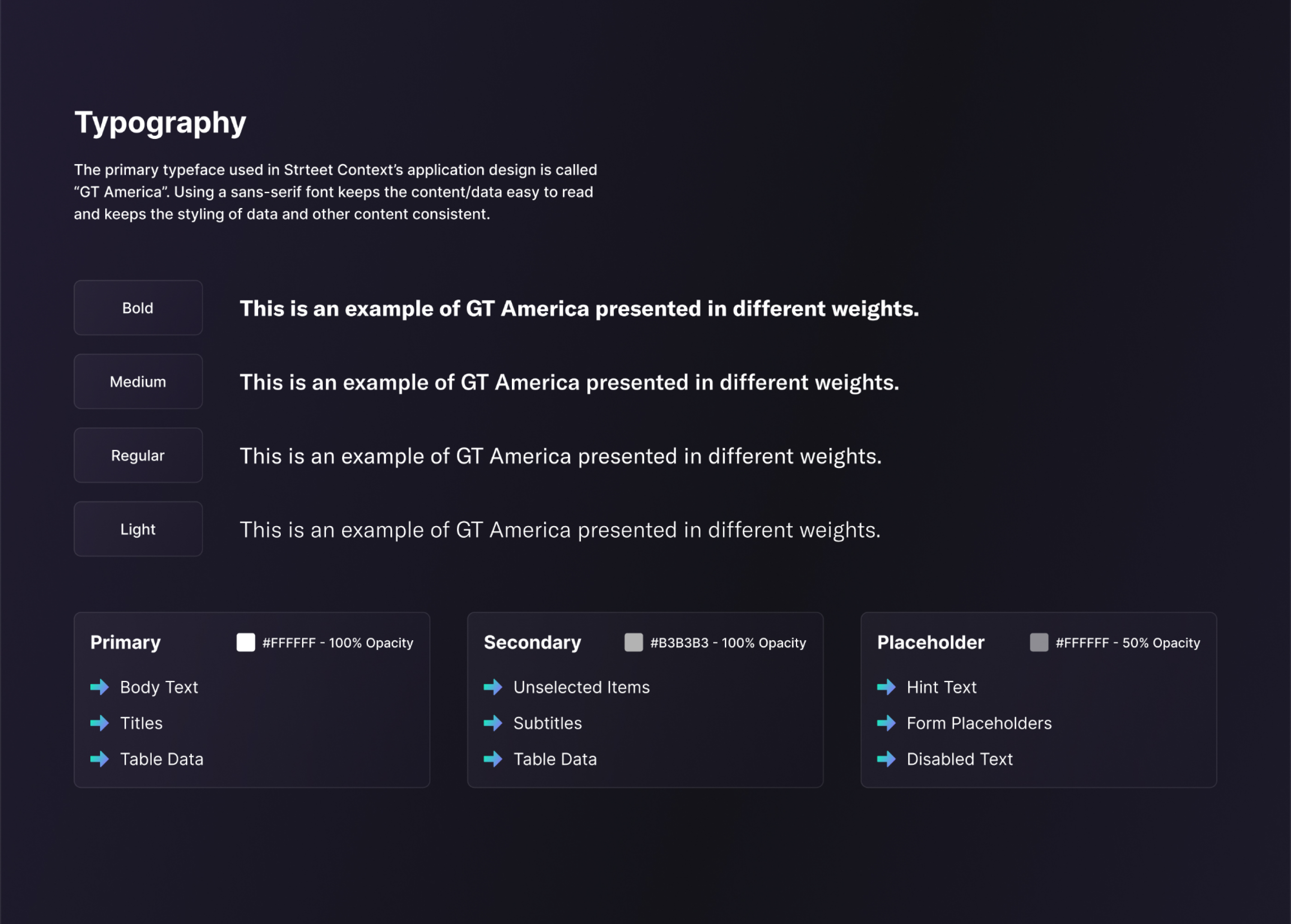
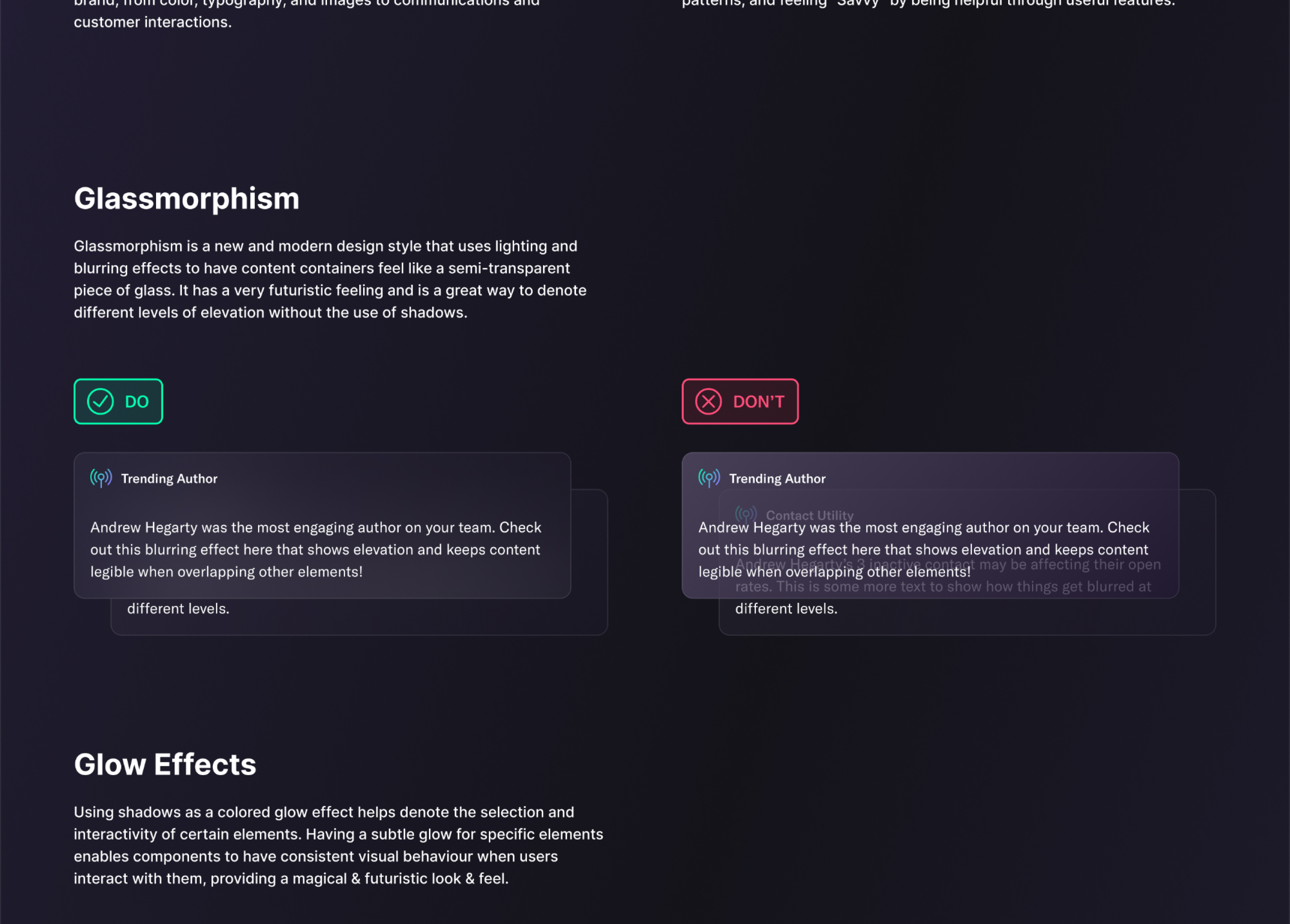
Creating the design system involved working closely with the marketing
team to determine the brand characteristics, and ensuring that the
design system reflected the company's visual identity.
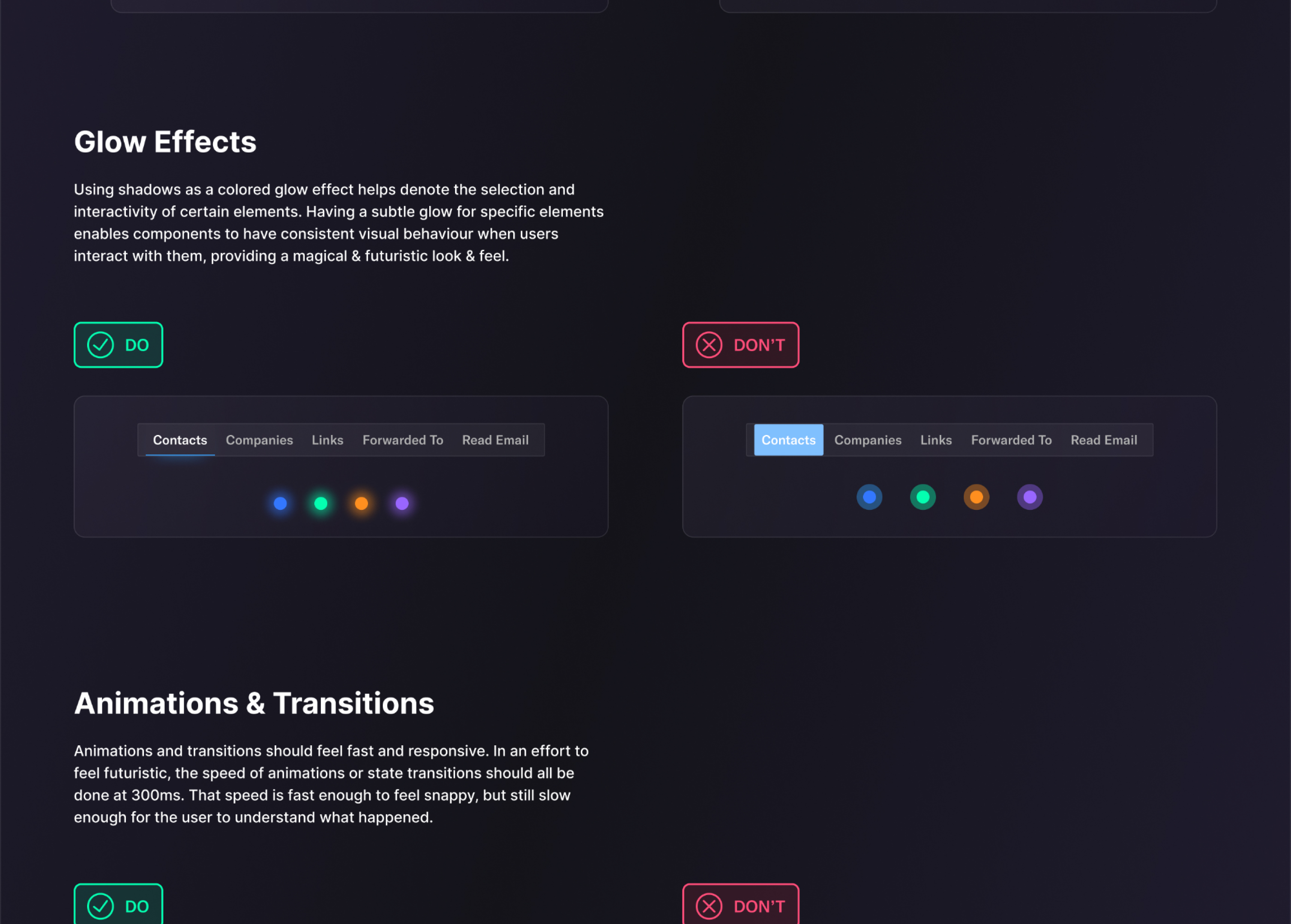
I also worked with the development team in evaluating the existing codebase to identify how best to integrate the design system with minimal disruption.
The design system also has web accessibility guidelines at the forefront, ensuring inclusivity for all users.
I also worked with the development team in evaluating the existing codebase to identify how best to integrate the design system with minimal disruption.
The design system also has web accessibility guidelines at the forefront, ensuring inclusivity for all users.
Goals & Alignment
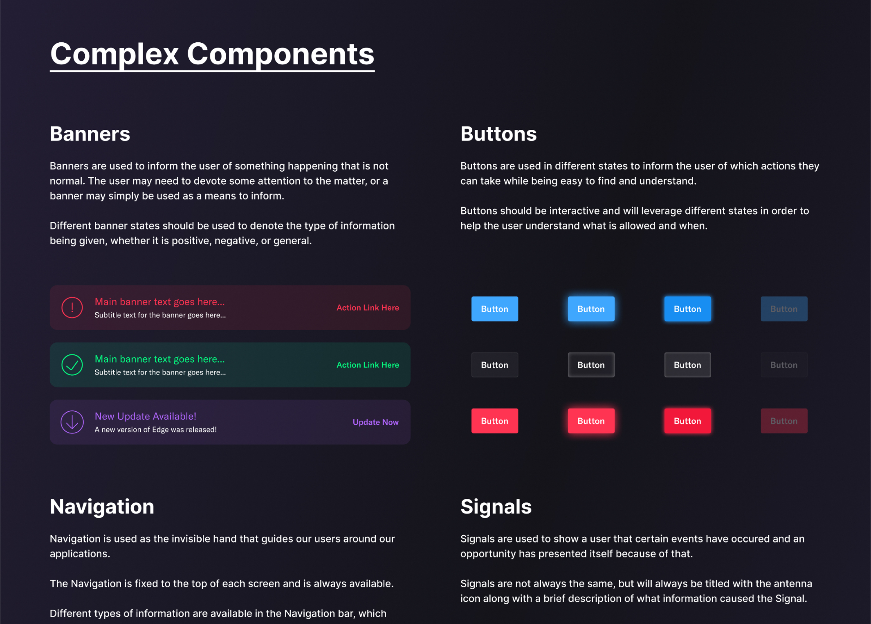
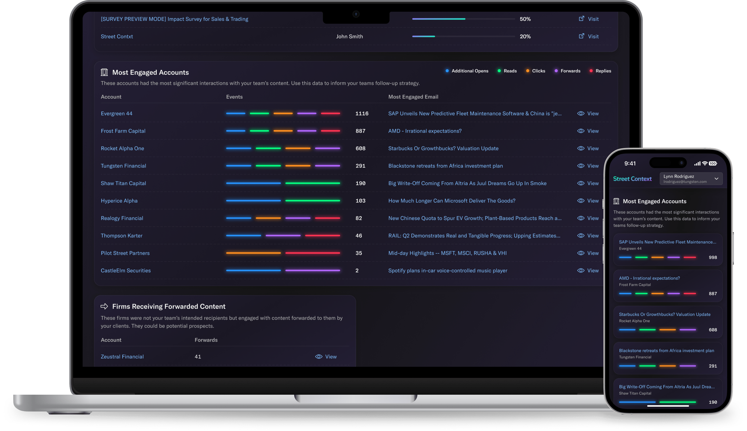
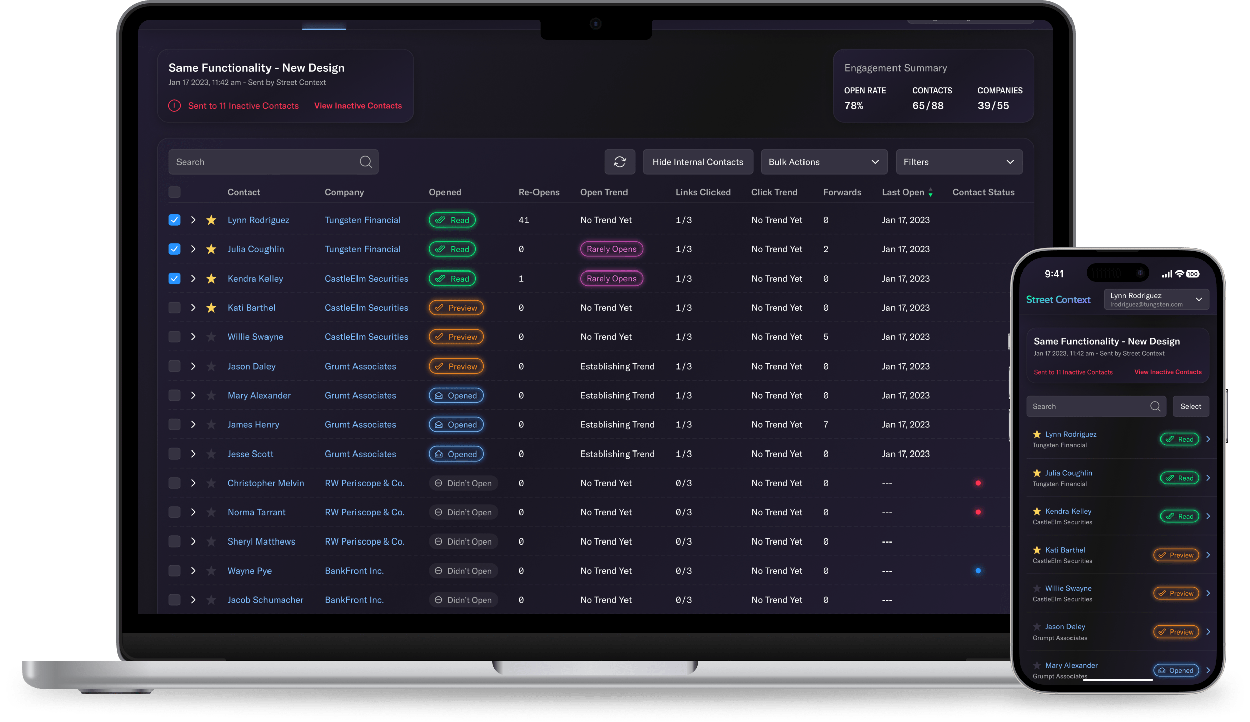
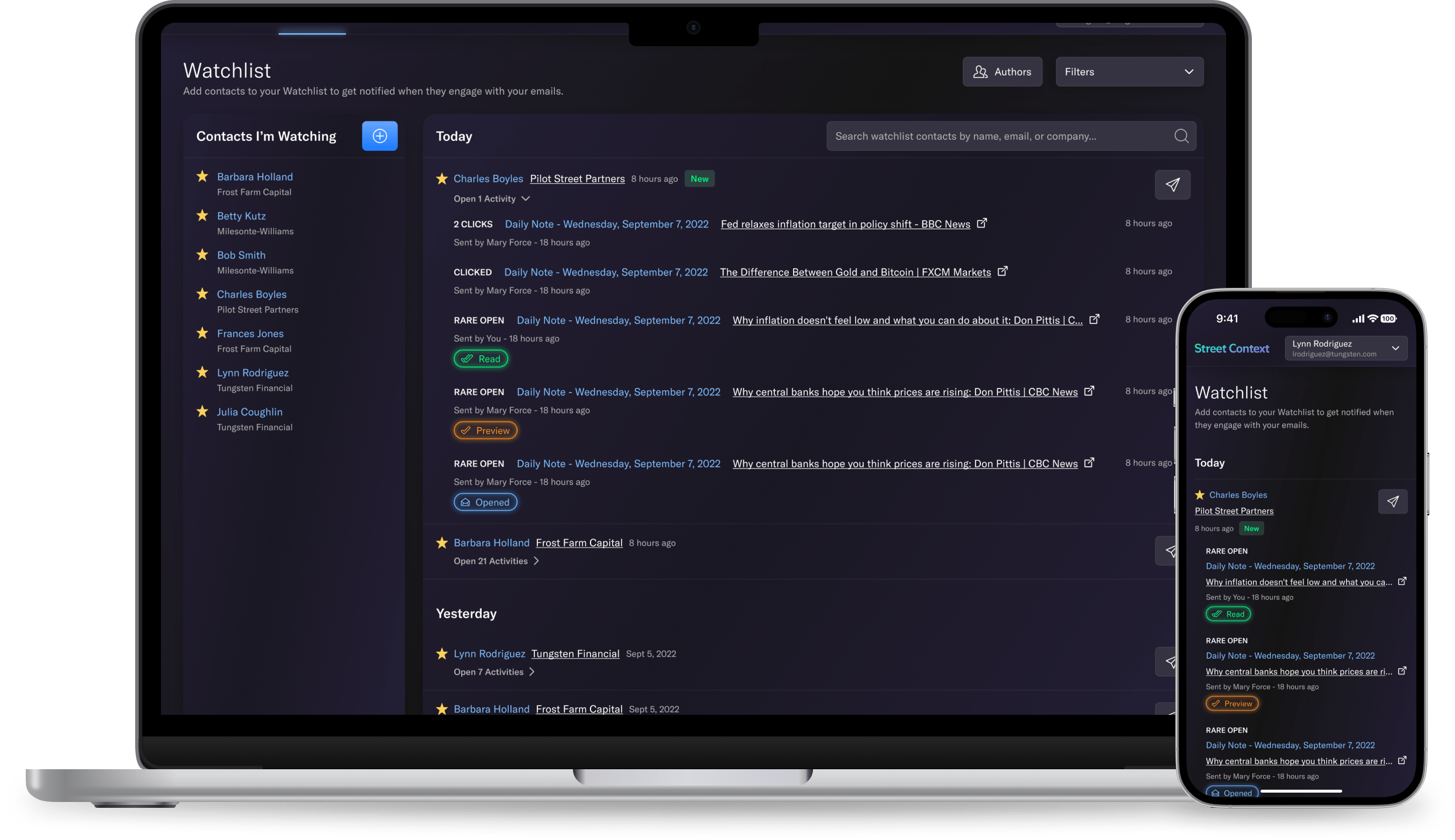
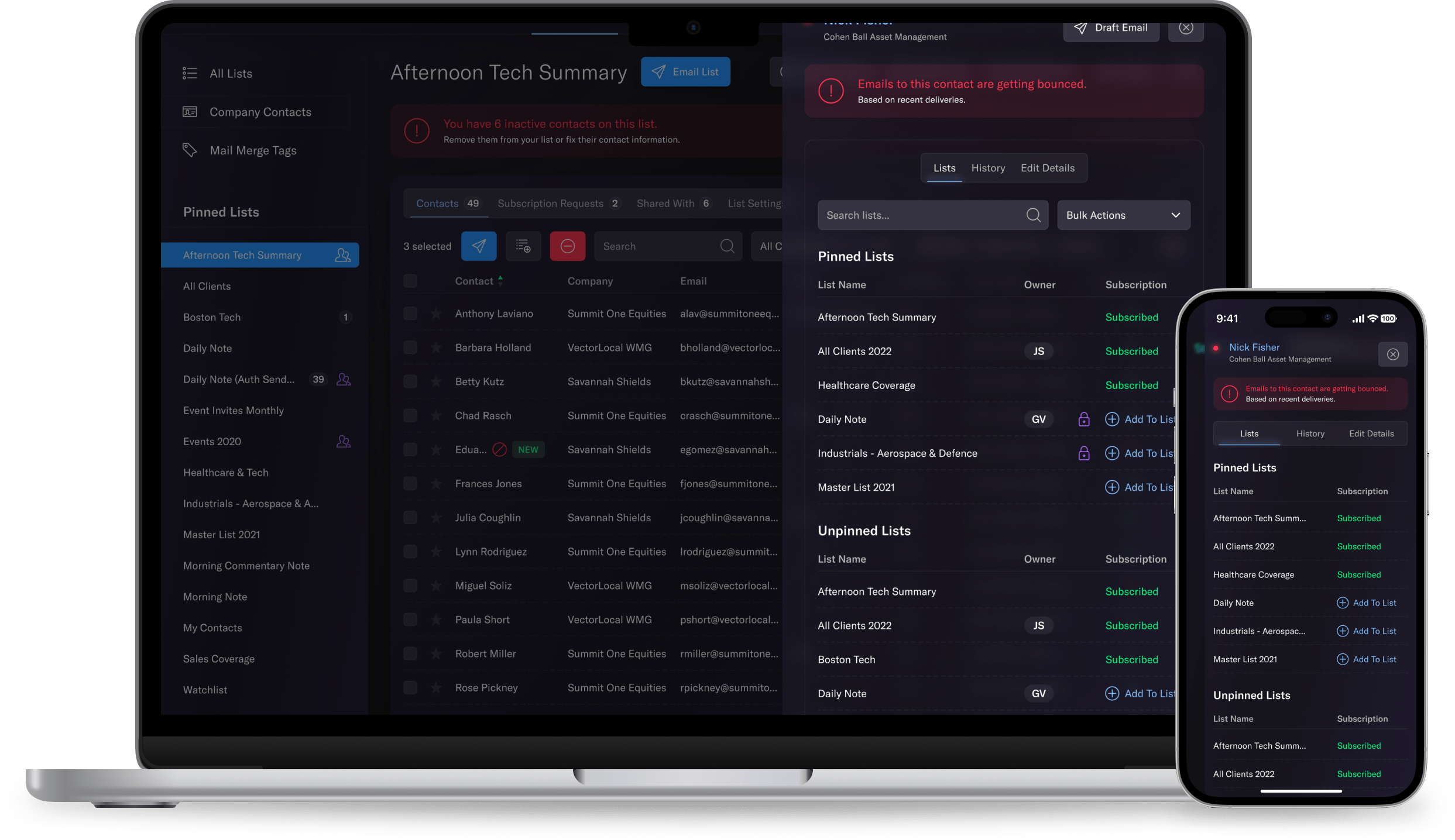
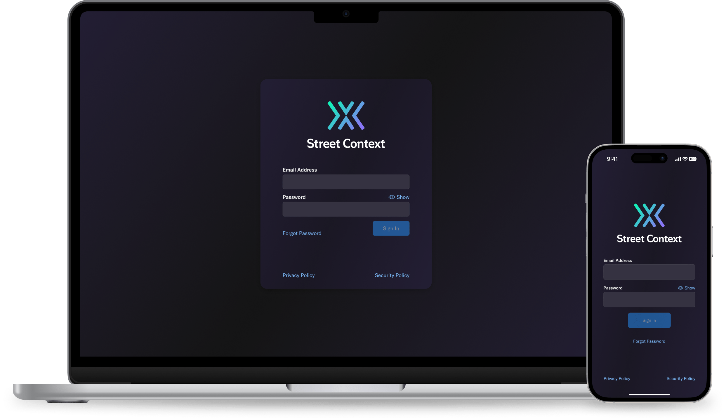
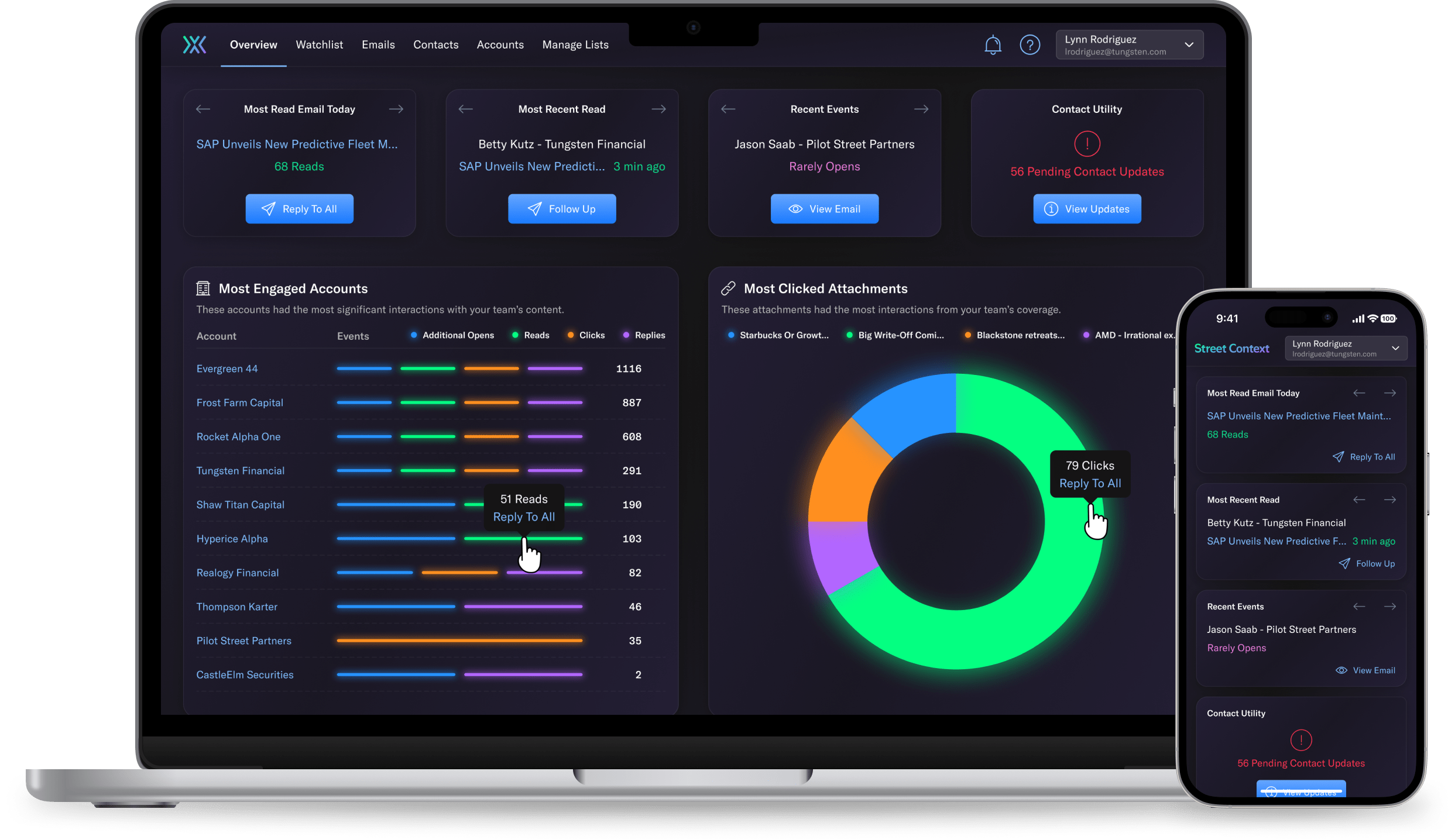
The primary goal of implementing the design system was to provide a
scalable and consistent user experience across StreetContext’s web
application.
By streamlining design and development processes, the design system aimed to improve efficiency, reduce errors, and empower our teams to deliver high-quality features faster.
The design system also aimed to enhance the overall brand perception and strengthen customer trust through a cohesive and user-friendly interface.
Takeaway Metrics
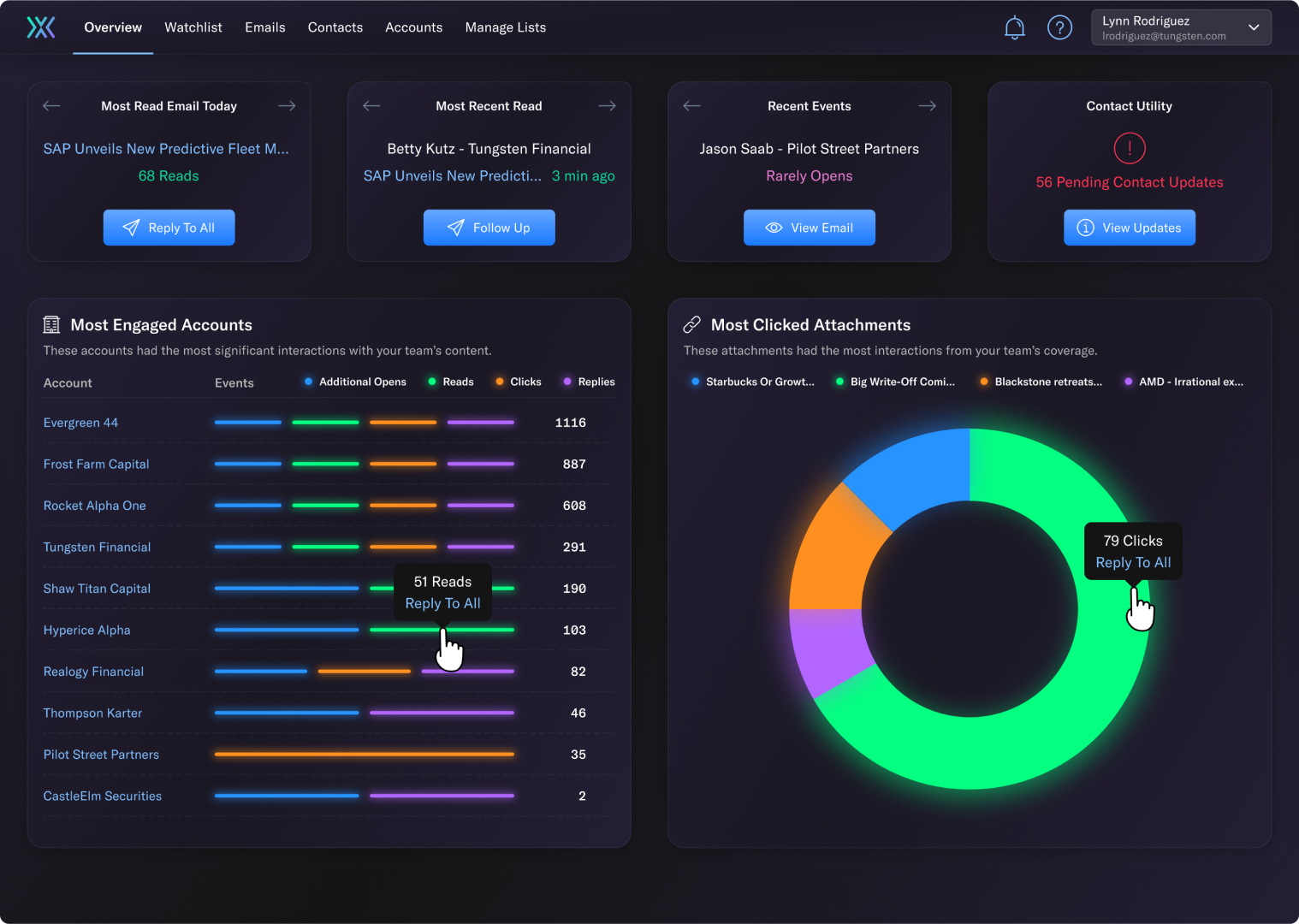
Overall, the implementation of a design system enabled StreetContext
to overcome design inconsistencies, improve development efficiency,
and deliver a cohesive user experience.
By aligning with strategic goals, nailing brand characteristics, and measuring success through developer velocity and customer satisfaction metrics, the design system became a valuable asset in enhancing their digital product.
By aligning with strategic goals, nailing brand characteristics, and measuring success through developer velocity and customer satisfaction metrics, the design system became a valuable asset in enhancing their digital product.
80% Reduction
Time UI-related tickets spend in Design Review.
90% Reduction
Design defects found during review.
Consistent UX
Features and components behave consistently.
